Painting Process of Abstract Horse-Bohemian Rhapsody
I want to share with you my thought process from start to finish as I go through the making of a painting. For this piece I started off with a charcoal drawing on paper. I don’t always do this because I am anxious to jump right in to the fun part, painting. But I find it familiarizes me with the subject matter, making the process somewhat easier as I go along. This particular drawing is charcoal on post-it-paper of all things. A friend gave it to me, so I thought why not use it to practice drawing.


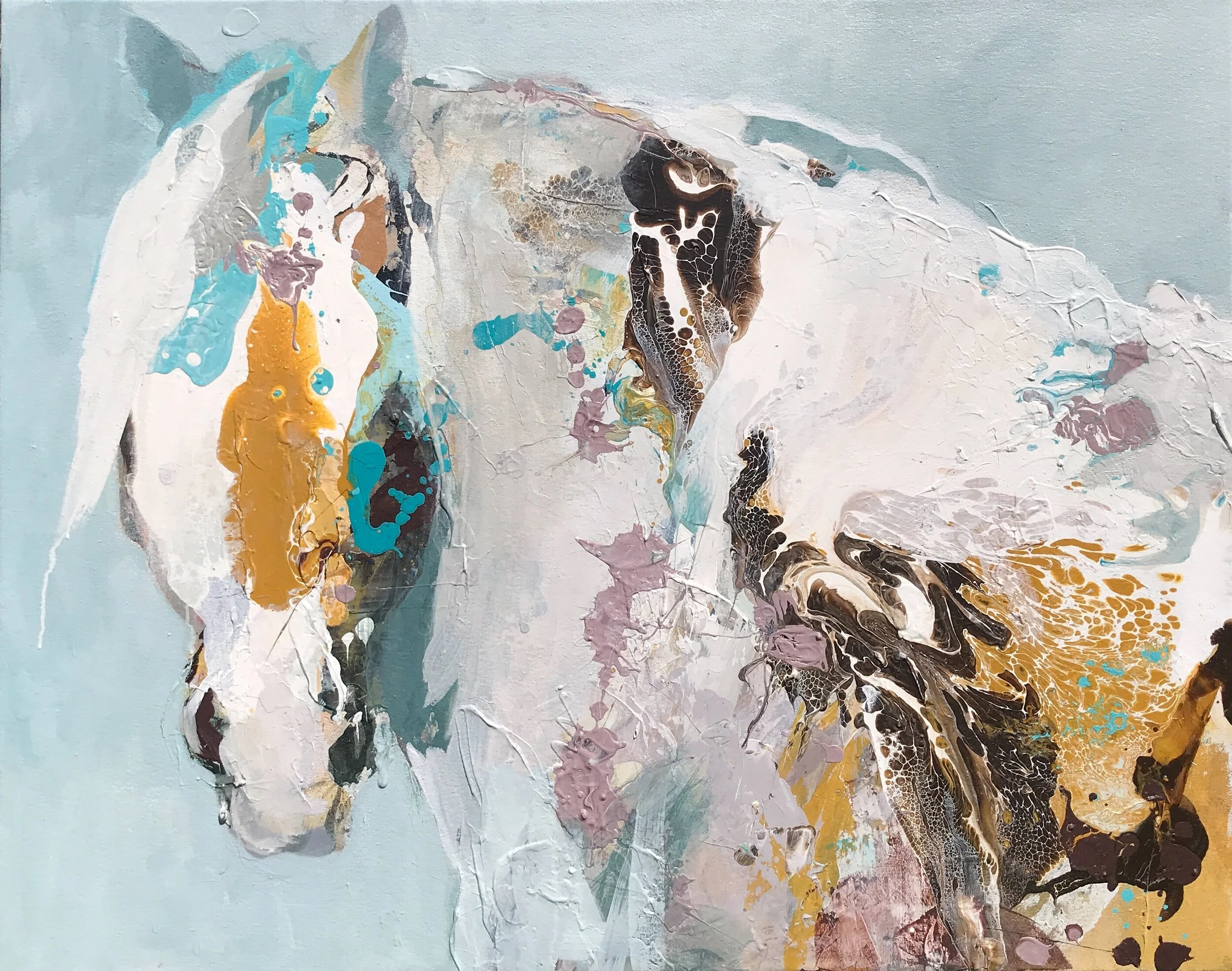
This is a small color study for the larger piece (54x50). I am learning over the years that practicing drawing and studying color is key to creating a respectable painting. Having already put some thought and effort into these small studies, my subconscious has soaked this in, and once I get into the larger piece, it’s like traveling down a familiar path and things seem to flow better.

Preparing the surface: For this piece I wanted to experiment with archival paper on a canvas with paint on it already, leaving some of that original paint peaking through. I like the quality of line-work I can get on paper over that of canvas. Once I attach my paper to canvas with a gel medium and let it dry, I draw in my subject with charcoal. Then wash the surface with some warm colors.
Next I am going in and working on establishing the horse form with paint. I establish my lights and darks with a neutral color. Then come in applying color with brushwork and palette knife. Building up the surface from thin to thicker and dark to light, while also tearing some of the paper away. Attempting to stay within the colors and values I have chosen. I have not stuck to my original color study as the predominately warm colors I laid in on the background led me in another direction. It happens. So I am deciding at this point I think I want this piece to have warmer/hotter colors overall. I like where this is at right now and let it rest. Which I did for a few days. But it wasn’t quit doing it for me. Not sure what it was maybe it didn’t have enough energy. This is the point where I like what I got, but I know it’s not quite there yet, but I am afraid to lose all the work I’ve already put in. This is where I just say to myself “fu** it” and go in with flinging paint.


So I go in and shake it up a bit. I’ve ruined many a good painting by doing this. I get myself in a spot that I can’t get myself out of. It’s easy to go overboard with this part of the process, it’s hard to stop, ‘cause it’s pretty fun. Sometimes it works out, and then sometimes it doesn’t.. So this is what I am left with after all my fun. Not where I want this piece to be right now.


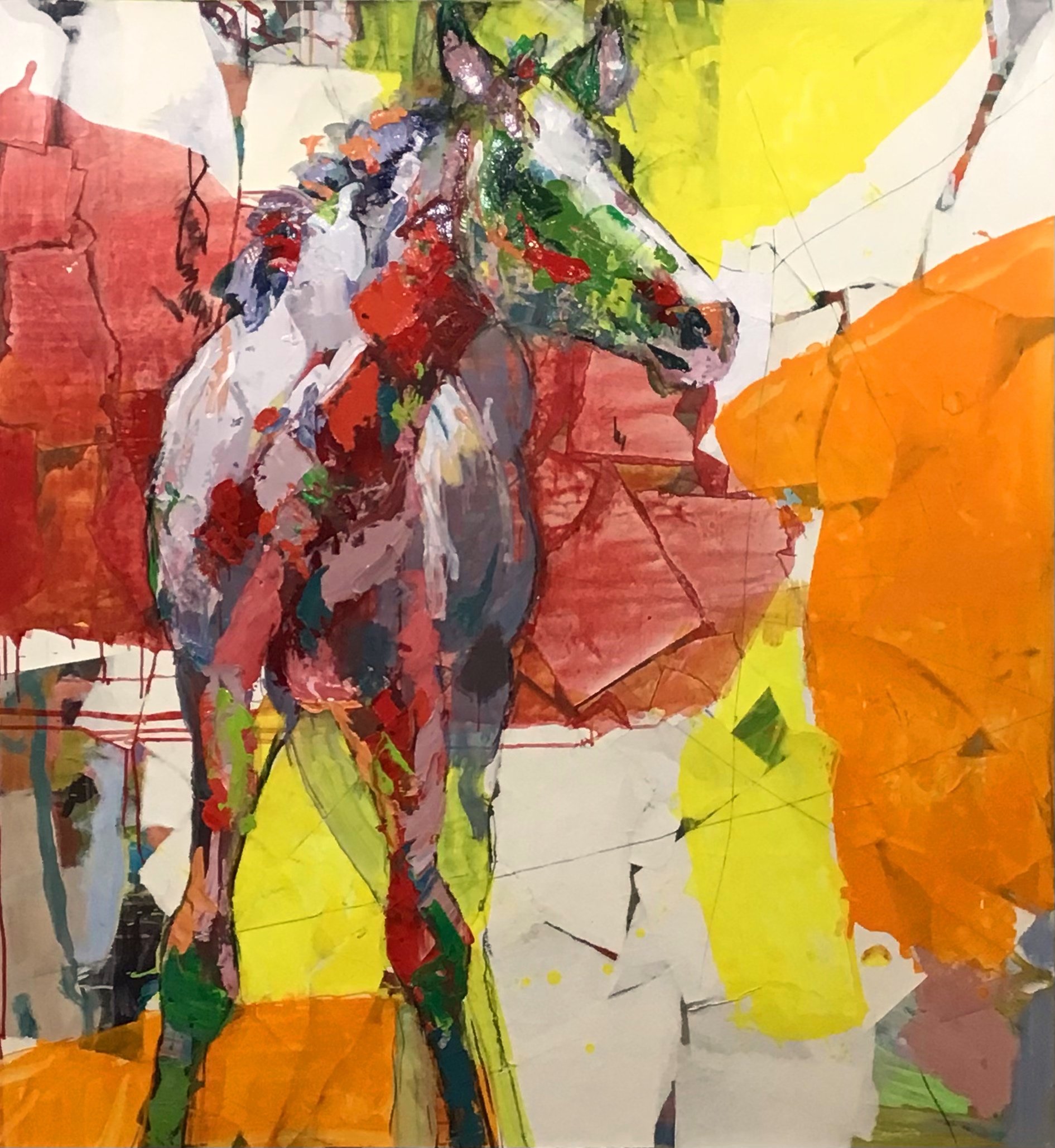
Again, I let it sit for a day. Pondering, what the hell do I do? OK, let’s bring back some of those warm colors that I covered up and push back and cover up some of the busyness. I go in with large blocks of warms reds and oranges and balance it out with little bits of blues and greens. Now I am getting back in the game. I am liking it a lot. I was going to stop here, but after letting it sit for a day I decided it needed a little more work.
So went in with some more paper to cover up a few areas to give the piece some space . I covered the blue line coming in from the right because It was reading to much like another horse leg and it was bothering me. I covered some of the upper left to tone down the head and neck . Also added a piece of paper that had black paint on it and it just happened to look like a eye. Love those happy accidents. So I haven’t touched it for a few days. I think it’s finished, for now…

Bohemian Rhapsody | 54x50 | mixed media on canvas